It’s easy to assume that increasing sales means attracting more visitors to your supplement brand, but that’s only half of the equation. If people are already finding your products but leaving before completing a purchase, there could be far bigger opportunities hiding within the website itself.
Conversion Rate Optimisation (CRO) is all about improving the experience for the people who are already there. Instead of spending more money driving additional traffic, it focuses on removing the obstacles that prevent customers from buying. Sometimes those obstacles are obvious, but more often they’re small details that gradually introduce doubt or frustration as someone moves through your website.
Reviewing your website every few months can uncover opportunities that are surprisingly easy to fix, and over time those incremental improvements often have a greater impact than a complete redesign.
Is Your Homepage Explaining Why People Should Choose You?
Visitors should be able to understand what your business offers within a few seconds of arriving on your homepage. That doesn’t mean squeezing every product, promotion and message above the fold. It means making your proposition clear enough that someone immediately understands who you are, what you sell and why your products are worth exploring further.
Many supplement websites rely on generic phrases that could apply to almost any competitor. If your homepage only talks about premium ingredients, quality formulations or expert manufacturing, you’re unlikely to give visitors a memorable reason to stay. Your messaging should communicate what genuinely makes your business different and encourage people to continue browsing.
Can Customers Find Products Without Thinking About It?
Good navigation often goes unnoticed because it simply works. Customers shouldn’t have to guess which category contains the product they’re looking for or scroll through dozens of similar items before finding something relevant. Clear menu structures, useful filters and logical product categories all make the shopping experience feel much more straightforward.
It’s also worth considering how people actually shop. Some visitors know exactly what ingredient they’re looking for, while others are searching for support with sleep, energy, gut health or recovery. Making it easy to browse in different ways allows your website to cater for both.
Are Your Product Pages Answering Real Questions?
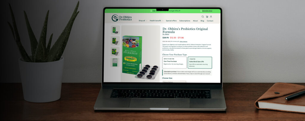
Product pages often focus heavily on features while overlooking the information customers actually want before making a purchase.Beyond ingredients and serving sizes, people want to know who the product is suitable for, how it fits into a daily routine, what makes it different from similar options and what other customers have experienced. If those questions aren’t answered naturally throughout the page, visitors may leave to continue researching elsewhere.
Good product pages educate without overwhelming. They build confidence by providing the right information at the right time, allowing customers to make informed decisions without feeling like they’re reading a technical manual.
Is It Easy to Trust Your Brand?
Trust influences every stage of the buying journey, yet it’s often treated as something that’s only addressed through customer reviews. While reviews are valuable, they’re only one part of the picture. Professional photography, consistent branding, transparent delivery information, accessible customer support, straightforward returns policies and accurate product information all contribute towards creating confidence.
Customers notice these details, even if they don’t consciously think about them. Together they create the impression of a business that’s reliable, established and worth buying from.
Are You Giving Customers a Reason to Spend More?
Conversion optimisation isn’t only about increasing the number of orders. It’s also about helping customers discover products that genuinely complement what they’re already buying.
Bundles, frequently purchased together recommendations and sensible quantity discounts can all increase average order value while improving the shopping experience. The key is making those suggestions feel helpful rather than interruptive. Customers should feel like you’re simplifying their decision rather than trying to maximise every transaction.
Have You Tested the Checkout Yourself Recently?
Checkout is one of the easiest places for unnecessary friction to appear because it’s often left untouched for long periods. Running through the process yourself every few weeks can reveal issues that would otherwise go unnoticed. Long forms, confusing delivery options, unexpected costs or unnecessary account creation requirements can all encourage customers to abandon their baskets at the final hurdle.
The smoother the checkout feels, the less opportunity there is for second thoughts.
Small Improvements Soon Add Up
Many businesses approach CRO as a one-off project, but the most successful ecommerce brands treat it as an ongoing process. Customer behaviour changes, expectations evolve and new opportunities appear as your website grows.
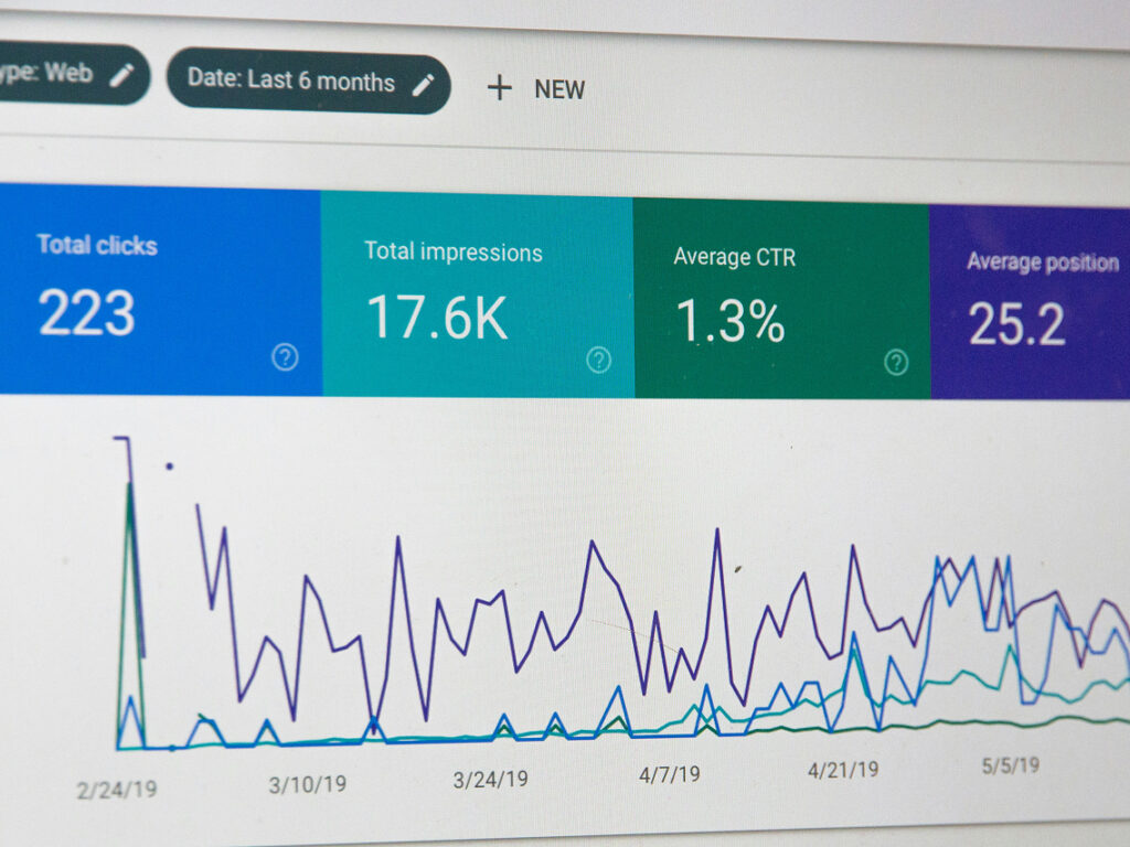
Reviewing analytics, watching how people interact with your website and regularly testing different ideas helps build a clearer picture of what’s working and where improvements can be made. Those changes don’t need to be dramatic to have an impact. In many cases, it’s the accumulation of dozens of small refinements that creates a website that’s easier to use, more enjoyable to browse and ultimately far more effective at converting visitors into customers.